Everyone in the math community is all excited about the aperiodic monotiles that were discovered.
I don’t have much to add, but I did recreate it in Solidworks and laser cut it out:
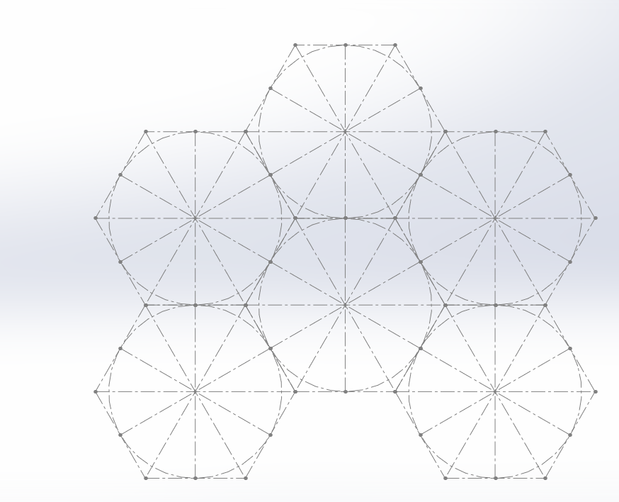
I created a hexagon, and subdivided with construction lines, and saved that as a block.
I then inserted 5 more of these blocks:
Note that I think the ‘center’ doesn’t actually need to be in the center, and it will still tile, for more interesting shapes:
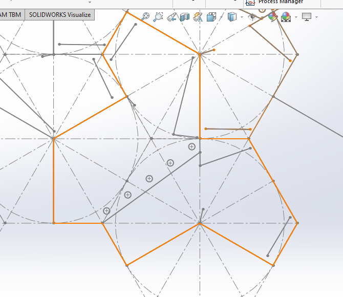
Then I draw the shape I wanted, shown in orange, and saved this as a block.
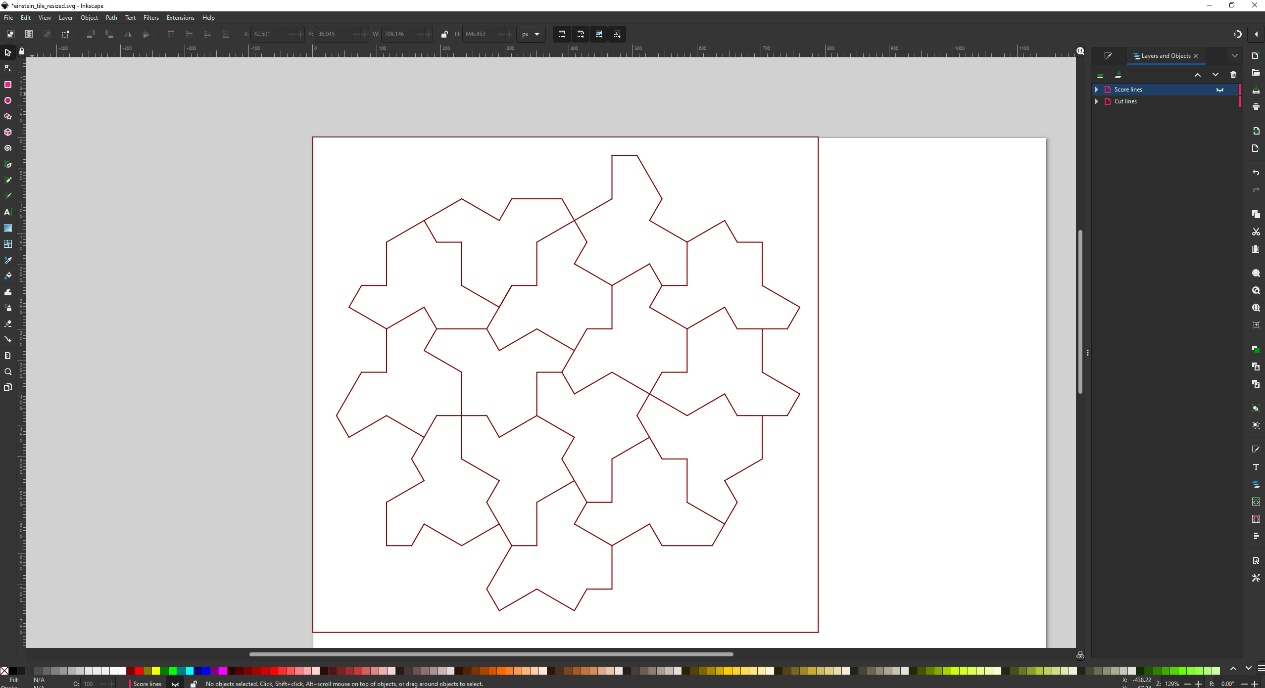
Then I created TWO new blocks. In the first block, I inserted that orange outline block, and drew on the shirt pattern. Then in the second block, I insert the same block, but mirrored it and drew on the back of the t-shirt.
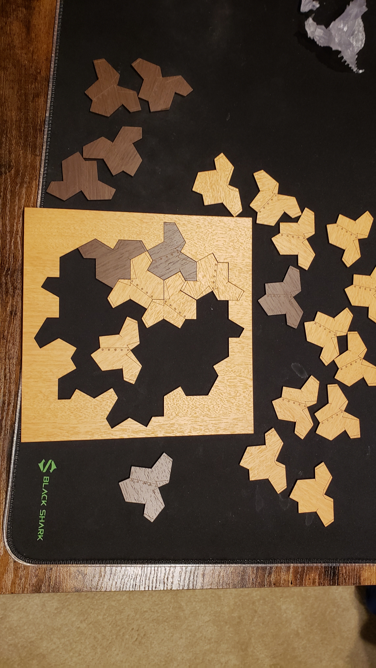
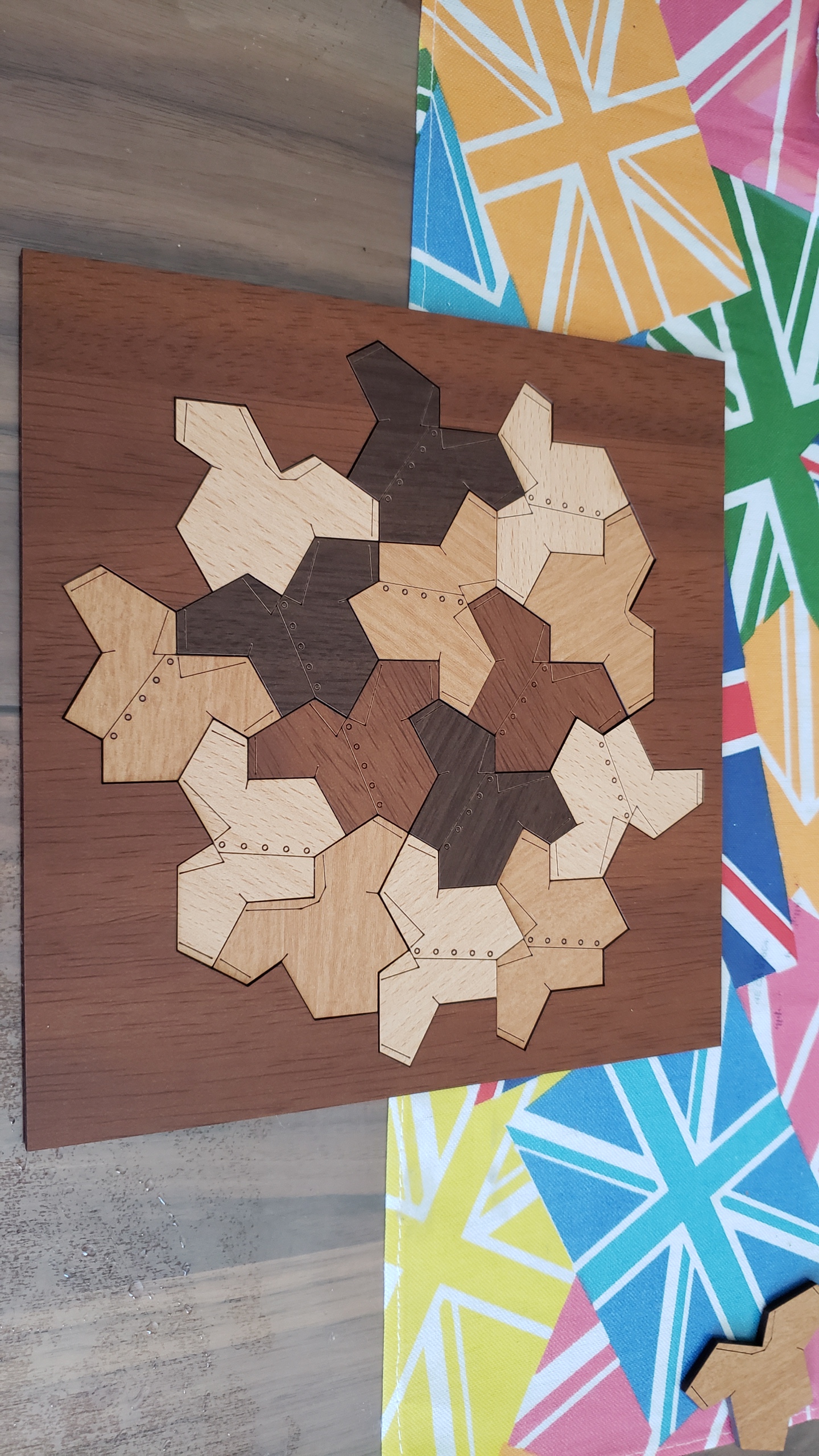
Then I could insert a whole bunch of the two blocks, and manually arrange them together like a jigsaw, snapping edges together.
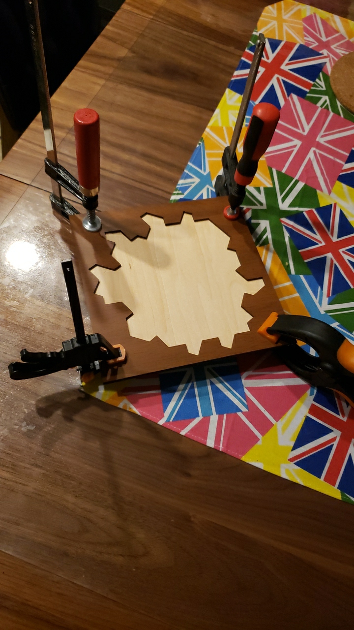
Then saved it as a DXF file and imported it into Inkscape, manually moving the cut lines and score lines to separate layers and giving them separate colors. I also had to manually delete overlapping lines. I’m not aware of a better approach.
Ahead of time, generate an embedding vector for each of your company-specific document / page / pdf . You can even break up large documents and generate an embedding vector for each chunk individually.
For example for a medical system:
Gastroesophageal reflux disease (GERD) occurs when stomach acid repeatedly flows back into the tube connecting your mouth and stomach (esophagus). This backwash (acid reflux) can irritate the lining of your esophagus. Many people experience acid reflux from time to time. However, when acid reflux happens repeatedly over time, it can cause GERD. Most people are able to manage the discomfort of GERD with lifestyle changes and medications. And though it’s uncommon, some may need surgery to ease symptoms. ↦ [0.22, 0.43, 0.21, 0.54, 0.32……]
When a user asks a question, generate an embedding vector for that too: “I’m getting a lot of heartburn.” or “I’m feeling a burning feeling behind my breast bone” or “I keep waking up with a bitter tasting liquid in my mouth” ↦ [0.25, 0.38, 0.24, 0.55, 0.31……]
Compare the query vector against all the document vectors and find which document vector is the closest (cosine or manhatten is fine). Show that to the user:
User: I'm getting a lot of heartburn.
Document: Gastroesophageal reflux disease (GERD) occurs when stomach acid repeatedly flows back into the tube connecting your mouth and stomach (esophagus). This backwash (acid reflux) can irritate the lining of your esophagus.
Many people experience acid reflux from time to time. However, when acid reflux happens repeatedly over time, it can cause GERD.
Most people are able to manage the discomfort of GERD with lifestyle changes and medications. And though it's uncommon, some may need surgery to ease symptoms.
Pass that document and query to GPT-3, and ask it to reword it to fit the question:
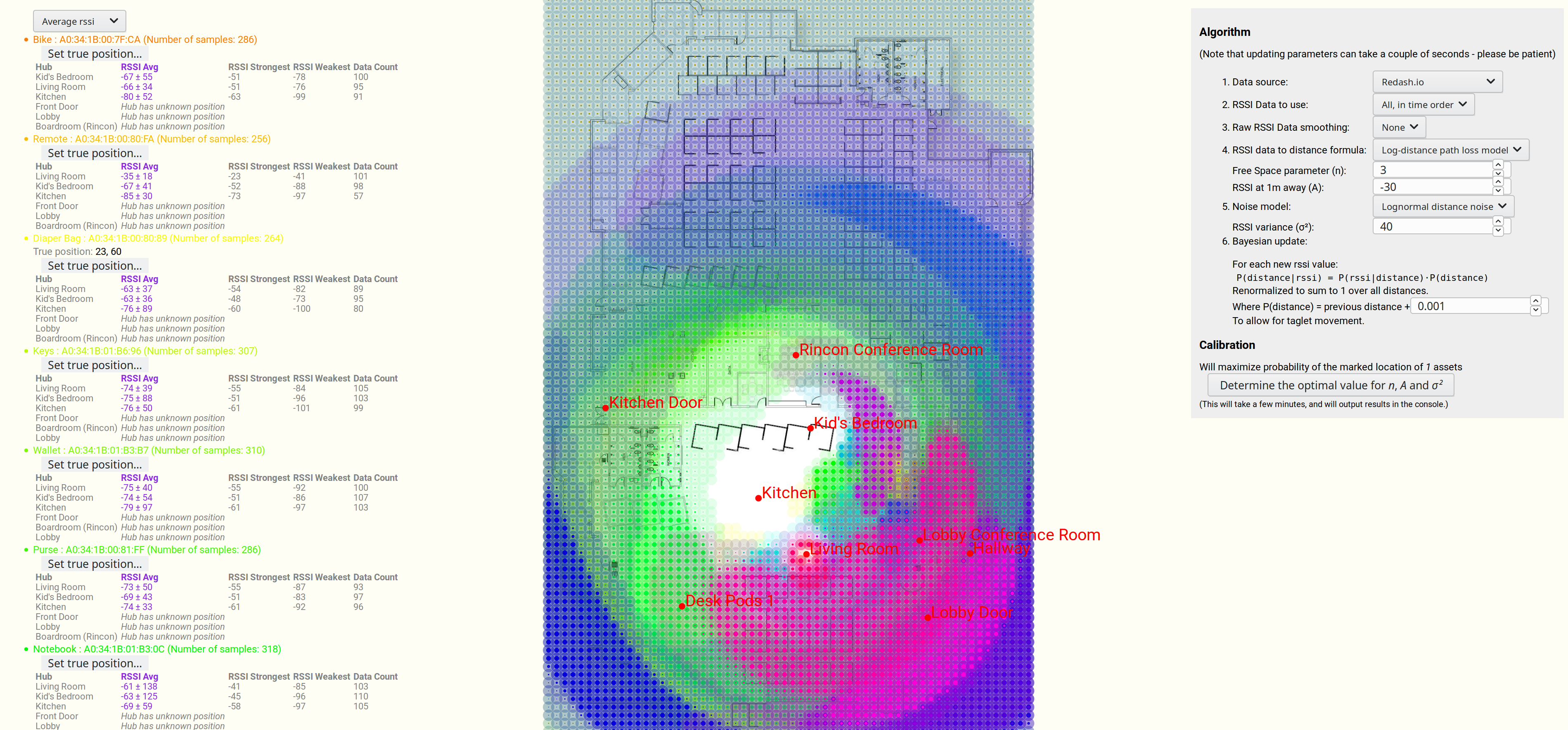
Imagine you have a bluetooth device somewhere in your house, and you want to try to locate it. You have several other devices in the house that can see it, and so you want to triangulate its position.
This article is about the result I achieved, and the methodology.
I spent two solid weeks working on this, and this was the result:
Estimating the most probable position of a bluetooth device, based on 7 strength readings.
We are seeing a map, overlaid in blue by the most likely position of a lost bluetooth device.
And a more advanced example, this time with many different devices, and a more advanced algorithm (discussed further below).
Note that some of the devices have very large uncertainties in their position.
Estimating position of multiple bluetooth devices, based on RSSI strength.
There are quite a few articles, video and books on estimating the distance of a bluetooth device (or wifi hub) based on knowing the RSSI signal strength readings.
But I couldn’t find any that gave the uncertainty of that estimation.
Noise is Normally distributed, with mean 0 and variance σ²
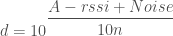
d is our distance (above) or estimated distance (below)
Rearranging to get an estimated distance, we get:
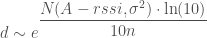
Now Noise is sampled from a Normal distribution, with mean = 0 and variance = σ², so let’s write our estimated d as a random variable:
Important note: Note that random variable d is distributed as the probability of the rssi given the distance. Not the probability of the distance given the rssi. This is important, and it means that we need to at least renormalize the probabilities over all possible distances to make sure that they add up to 1. See section at end for more details.
Adding a constant to a normal distribution just shifts the mean:
Now let’s have a bit of fun, by switching it to base e. This isn’t actually necessary, but it makes it straightforward to match up with wikipedia’s formulas later, so:
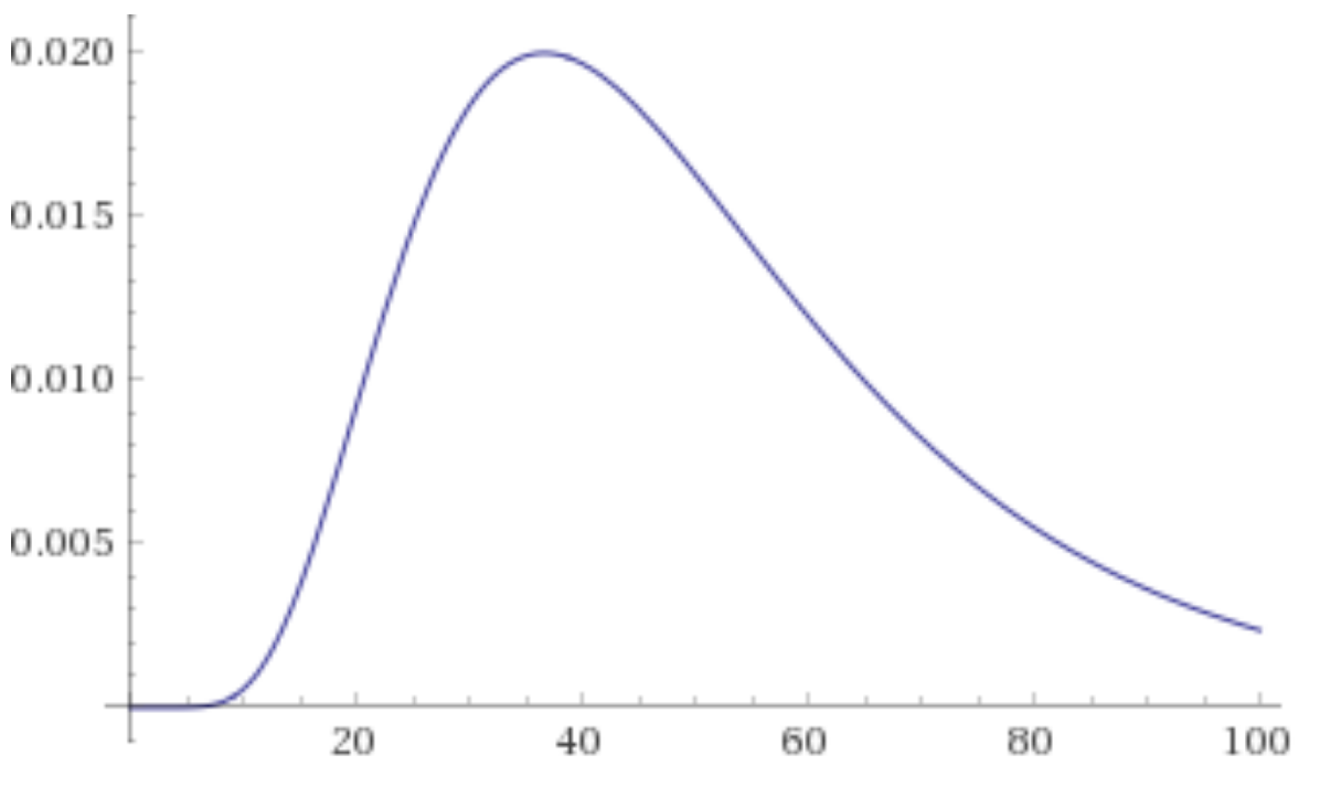
Distance in meters against probability density, for an rssi value of -80, A=-30, n=3, sigma^2=40
Bayes Theorem
I mentioned earlier:
Important note: Note that random variable d is distributed as the probability of the rssi given the distance. Not the probability of the distance given the rssi. This is important, and it means that we need to at least renormalize the probabilities over all possible distances to make sure that they add up to 1. See section at end for more details.
So using the above graph as an example, say that our measured RSSI was -80 and the probability density for d = 40 meters is 2%.
The Laplace Transform is a particular tool that is used in mathematics, science, engineering and so on. There are many books, web pages, and so on about it.
And yet I cannot find a single decent visualization of it! Not a single person that I can find appears to have tried to actually visualize what it is doing. There are plenty of animations for the Fourier Transform like:
But nothing for Laplace Transform that I can find.
So, I will attempt to fill that gap.
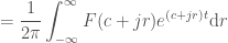
What is the Laplace Transform?
It’s a way to represent a function that is 0 for time < 0 (typically) as a sum of many waves that look more like:
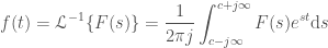
Graph of
Note that what I just said isn’t entirely true, because there’s an imaginary component here too, and we’re actually integrating. So take this as a crude idea just to get started, and let’s move onto the math to get a better idea:
Math
The goal of this is to visualize how the Laplace Transform works:
Note: The graphs say “Next frequency to add: … where “, but really it should be “Next two frequencies to add: … where ” since we are adding two frequencies at a time, in such a way that their imaginary parts cancel out, allowing us to keep everything real in the plots. I fixed this comment in the code, but didn’t want to rerender all the videos.
A cubic polynomial:
A cosine wave:
Now a square wave. This has infinities going to infinity, so it’s not technically possible to plot. But I tried anyway, and it seems to visually work:
Note the overshoot ‘ringing’ at the corners in the square wave. This is the Gibbs phenomenon and occurs in Fourier Transforms as well. See that link for more information.
Now some that it absolutely can’t handle, like: . (A function that is 0 everywhere, except a sharp peak at exactly time = 0). In the S domain, this is a constant, meaning that we never converge. But visually it’s still cool.
Note that this never ‘settles down’ (converges) because the frequency is constantly increasing while the magnitude remains constant.
There is visual ‘aliasing’ (like how a wheel can appear to go backwards as its speed increases). This is not “real” – it is an artifact of trying to render high frequency waves. If we rendered (and played back) the video at a higher resolution, the effect would disappear.
At the very end, it appears as if the wave is just about to converge. This is not a coincidence and it isn’t real. It happens because the frequency of the waves becomes too high so that we just don’t see them, making the line appear to go smooth, when in reality the waves are just too close together to see.
The code is automatically calculating this point and setting our time step such that it only breaksdown at the very end of the video. If make the timestep smaller, this effect would disappear.
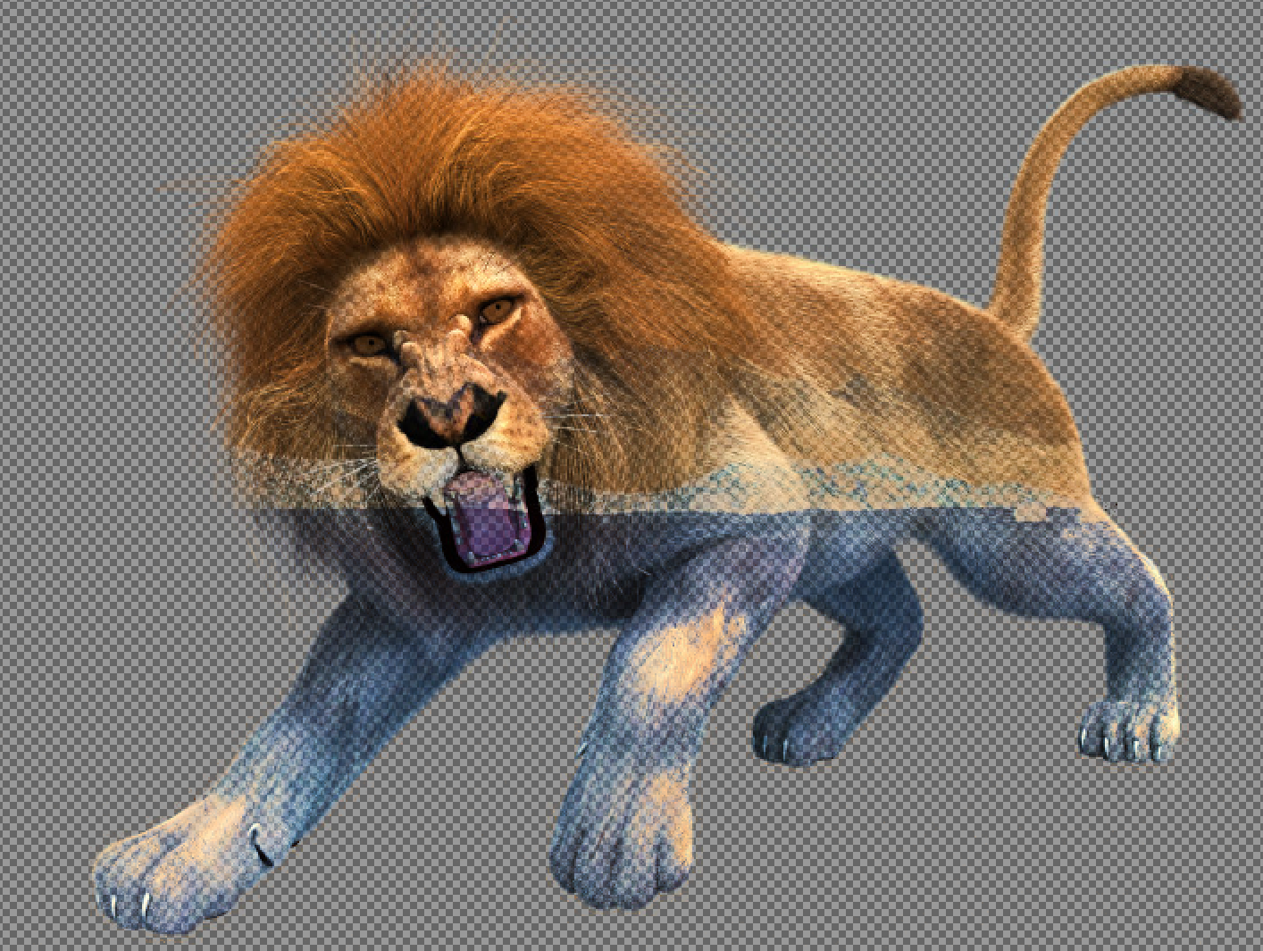
I have two opaque images – one with an object and a background, and another with just the background. Like:
Background
Background+foreground
I want to subtract the background from the image so that the alpha blended result is visually identical, but the foreground is as transparent as possible.
E.g:
Desired output (All images under Reuse With Modification license)
I’m sure that this must have been, but I couldn’t find a single correct way of doing this!
I asked a developer from the image editor gimp team, and they replied that the standard way is to create an alpha mask on the front image from the difference between the two images. i.e. for each pixel in both layers, subtract the rgb values, average that difference between the three channels, and then use that as an alpha.
But this is clearly not correct. Imagine the foreground has a green piece of semi-transparent glass against a red background. Just using an alpha mask is clearly not going to subtract the background because you need to actually modify the rgb values in the top layer image to remove all the red.
So what is the correct solution? Let’s do the calculations.
If we have a solution, the for a solid background with a semi-transparent foreground layer that is alpha blended on top, the final visual color is:
We want the visual result to be the same, so we know the value of – that’s our original foreground+background image. And we know – that’s our background image. We want to now create a new foreground image, , with the maximum value of .
So to restate this again – I want to know how to change the top layer so that I can have the maximum possible alpha without changing the final visual image at all. I.e. remove as much of the background as possible from our foreground+background image.
Note that we also have the constraint that for each color channel, that since each rgb pixel value is between 0 and 1. So:
So:
Proposal
Add an option for the gimp eraser tool to ‘remove layers underneath’, which grabs the rgb value of the layer underneath and applies the formula using the alpha in the brush as a normal erasure would, but bounding the alpha to be no more than the equation above, and modifying the rgb values accordingly.
Result
I showed this to the Gimp team, and they found a way to do this with the latest version in git. Open the two images as layers. For the top layer do: Layer->Transparency->Add Alpha Channel. Select the Clone tool. On the background layer, ctrl click anywhere to set the Clone source. In the Clone tool options, choose Default and Color erase, and set alignment to Registered. Make the size large, select the top layer again, and click on it to erase everything.
Result is:
When the background is a very different color, it works great – the sky was very nicely erased. But when the colors are too similar, it goes completely wrong.


 is a
is a 


 to
to  , and
, and  giving:

 “, but really it should be “Next two frequencies to add: … where
  ” since we are adding two frequencies at a time, in such a way that their imaginary parts cancel out, allowing us to keep everything real in the plots. I fixed this comment in the code, but didn’t want to rerender all the videos.
 . (A function that is 0 everywhere, except a sharp peak at exactly time = 0). In the S domain, this is a constant, meaning that we never converge. But visually it’s still cool.


 – that’s our original foreground+background image. And we know
  – that’s our background image. We want to now create a new foreground image,
  , with the maximum value of
  .
. so that I can have the maximum possible alpha without changing the final visual image at all. I.e. remove as much of the background as possible from our foreground+background image.
 since each rgb pixel value is between 0 and 1. So: